
Today I'm going to guide you through a very important css technique that may come in handy in the development of responsive websites. Say you have two columns in a row, you want to make a column to hold a fixed width and let the other column to shrink and expand when the screen width is resized and you also want to add 3 dots at the end of that shrinking column to indicate that the text is not fully shown, then this is for you.
If you want to skip the description and jump to the final code, click here.
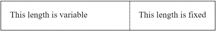
Initial HTML Snippet
The above image symbolizes a parent div with two child div's. This is where we start.
<div class="”parent”">
  <div class="”left”">This length is variable</div>
  <div class="”right”">This length is fixed</div>
</div>
Let's break our path down into a few steps..
1. Force the 'right' div to always hang on the right end.
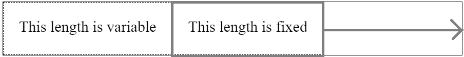
We want to keep the right div on the right corner and adjust the left column according to the resizing screen.
To push the right div to the 'right' side, we write the following css,
.left {
  flex-grow: 1;
}
.right {
  flex-grow: 0;
}
flex-grow property is actually a proportion between flex elements indicating the amount of the available space inside the flex container the item should take up. So in the above code, the 'left' div and the 'right' div will take up the available space in 1:0 proportion which means the 'left' div will take up the complete free space when parent is widened. Hence the right element is pushed to the right and will hang on the right end whatsoever.
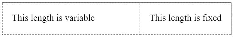
Now on resize, the 'left' and 'right' will behave like the following.

But wait..! We didn't achieve our goal yet.
- The text on 'left' shouldn't break into an another line.
- The text on 'right' shouldn't break into an another line either.
- Three dots should appear at the end of 'left'.
2. Limiting the text on 'left' to a single line.
Add
white-space: nowrap;
to the 'left' and it will maintain the text within one line regardless of the screen width. But then when the reducing width reaches a limit, the 'left will stop shrinking. It will stop at a fixed width. But as we don't want that, we add the following css to 'left'
overflow: hidden;
Now the 'left' will shrink even smaller than its actual width.

3. Limiting the text on 'right' to a single line.
Add
flex-shrink: 0;
to the 'right' so that it's shrink ratio becomes 0 which effectively means that the 'right' div will be having a fixed width and it solves our problem.
If you are using bootstrap 4, without using explicit flex values we can achieve something little similar to the above result simply with no css by the following.
<div class="”row”">
  <div class="”col”">This length is variable</div>
  <div class="”col-auto”">This length is fixed</div>
</div>
Snippet - CodePen
4. Bringing in the Three Dots
Add
text-overflow: ellipsis;
to the 'right' and the 3 dots will start appearing when it's shrunk smaller than its actual width.
So we finally achieved the goal!
Final Code
<div class="”parent”">
  <div class="”left”">This length is variable</div>
  <div class="”right”">This length is fixed</div>
</div>
And the Final CSS be,
.parent {
  display: flex;
}
.left {
  flex-shrink: 1;
  flex-grow: 1;
  white-space: nowrap;
  overflow: hidden;
  text-overflow: ellipsis;
}
.right {
  flex-shrink: 0;
}
By default, a flex item has its flex-grow set to 0, otherwise we would have to add it manually to .right div.
Code Snippet - CodePen
Leave a Comment